Story #42 - Logo Evolution
/Story #42 is the evolution of the SSM logo
Over the course of 90 years, our logo received a few well-deserved facelifts. But with each change, we've expanded on the story of SSM - who we are, what we do, and why we do it. Today, we're proud of our logo because it defines us. It displays our value, and it reinforces our purpose.
The original SSM logo. Our civil/surveying capabilities represented by the tripod, and our engineering services for air, water and buildings represented in the other three symbols.
The logo design was modified in 1985 to remove the symbols, as well as to revise the oval shape.
SSM acquired an environmental laboratory and other engineering firms in various regions. In July 1991 a new logo was developed for use by The SSM Group, Inc., SSM’s parent company.
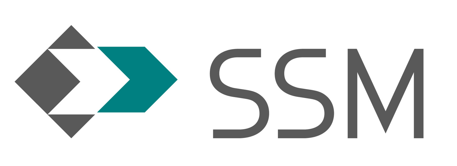
New logo and colors are introduced in 1997. The white space creates a sigma, the symbol for “sum of.” For SSM, it represents the sum of our deep and diverse technical expertise and synergistic services as well as our commitment to quality and responsiveness. The sum of all of these things is that value that SSM brings.
The logo is updated in 2004. Maintaining the sigma, the arrow is extended. The arrow sits not only ahead; it is also intentionally offset. This represents forward motion. It showcases the driving force that began all the way back in 1932 and continues to drive us toward the future.
Our current logo, updated in 2016, maintains our forward-thinking arrow, as well as our sigma to represent the sum of all things. SSM returned our colors to include Lou’s Blue as a representation of our founders.


Daniel McBrien, CEM has been approved as a Tune-Up Specialist by the City of Philadelphia’s Office of Sustainability.